Thursday, March 28, 2013

An Album of Precious Memories - Part 2

I am back with the second and concluding installment of my Vintage/ Shabby Chic Mini Album series. If you want to see the first part, click here. So without delay, let's get to it!


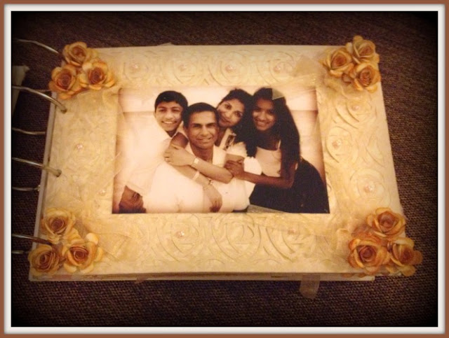
The picture above is page four. Isn't it a gorgeous photograph! A photo like this needed a beautiful but somewhat understated page, so that was I was trying to go for. The roses are all made from this kind of beige paper which I distressed using Wild Honey Distress ink. I also added a rose cutout background  which is a freebie from Birdscards.com over the pattern paper page to give an ornate feel to section.


Another lovely family photograph and for this page I kept it simple. An off centre doily, a big organza bow and a daisy in the middle. Again a few sporadic pearls to make it a little dainty.


The page above is the first page I did. The background as a plain beige so I added a touch of pale pink in the form of pearls, tiny roses and some pink cut outs. The spotted pink organza ribbon also added a nice touch I think. 


If you remember from my previous post, Anita Chechi was in touch to visit her ailing grandmother who  is pictured with her in the photograph above. That's why it was of particular importance that I did justice to the page. I chose a Vintage frame from the Silhouette online store and cut it out on some coffee brown punch paper. Once again pearls and organza ribbon added the appropriate accents. 


I've just added a couple of close ups of the some of the work I did to give you a better view. Once again I must apologise for the photographs. I didn't get the chance to take them during the day so it had to be night shots and we all know how they come out.  Anita Chechi was really touched by the album. Her eyes filled up a little as she found all her favorite photographs put together in one little book.

Thanks so much for stopping by and would love to hear your comments. Also if you want to know any of the supplies used in this project, please write to me at craftingtillthecrackofdawn@gmail.com

Wednesday, March 27, 2013

An Album of Precious Memories - Part 1

My husband's cousin Anita Chechi who leaves in the US, is one of those extremely generous and loving people who is frequently presenting my kids and me so many presents whenever she comes to town. So 2 weeks ago when she came to visit her ailing grandmother, I wanted to thank her with something really special and I felt a card just wouldn't do it. It was time for my first Mini Album.


The picture above is the cover of the album. The entire theme is vintage/ shabby chic and I have to give a great BIG SHOUT of thanks to the Gossip Girls over at Swap Central. Saumya did this awesome post on 'What is Vintage" a couple of weeks ago and it not only opened my eyes but inspired me to use these colours. I went with the Luxury Stack from DCVW which had just the right backdrop for the album.


This is the first page of the album and that's Anita Chechi in the photograph with her husband. I wanted to really dress up the page because this photograph is so fantastic. Hussena's bird cage card was posted at just about the same time and I thought - BIRD CAGE! YES! The cage, the leaves and the flowers are all cameo cut and the same layout exists on the other side of the page. Thanks Hussena! Again!


This is the next page of Anita Chechi's daughter when she was a little girl. I should mention that I wanted this album to be a complete surprise so I got all the photographs from Anita's facebook or her family's Facebook. I didn't ask her for any photographs. That's the great thing about Facebook - we only upload our best photos so I found some amazing snaps. Entering this page in Dream Valley Challenges 53 - Pearls and Lace


The next page is all about butterflies! The background page had some grey tinges so I made my butterflies grey. I distressed the edges and centre of each butterfly with some grey ink and that added really an aged look to them. Love it! Added some pearls following the swirls on the page - you can never go wrong with pearls right! Entering this page in Creative Creations Challenge 6 - The letter B (for the Butterflies!)


I've added some closeups of the detailing to give you a better look. And did you notice how all the photographs were tinted sepia? I did that because I wanted the photos to coordinate with the album theme. I personally feel that even the most beautiful album can lose its appeal when photos are added because the album is one theme and the photos don't complement it. So since I was going vintage with each page, I made the photos vintage too. It actually made each picture better I think. 


There are a few more pages to show which I will display in my next post. My only regret about this album is that I didn't get to take nice photographs of it since I was so so so pleased with the result. I spent three days and sleepless nights on it and it was ready just before we all met for dinner. So the photographs were taken after I presented it at night time - with my brother in law's couch as the backdrop.

Thanks so much for dropping by and would love to hear what you think of this creation. If you would like to know the supplies used or how I made anything specifically please write in to craftingtillthecrackofdawn@gmail.com. I am more than happy to share!

Tuesday, March 26, 2013

Recording Baby Hand and Foot Prints PRETTILY!!!

The Indian Craft Room has a fabulous new monthly scrapbook challenge. I'm so excited about it because I am an avid scrapper. Banu has come up with this fabulous sketch and I liked it so much I just wanted to get to work immediately. And here is my creation!


I've also used this weeks IBSIC color scheme for my layout. Our dear Hussena has done a guest post for it and as always her creation was so beautiful and inspiring! I'm not the only one who thinks so, Deepti too was so taken up by Hussena's card that she put her own spin on it and created something marvellous. I loved Hussena's lattice design as well and I thought, would that look awesome on a layout and here we are!


I have added some close-ups of the project. Instead of using photos, I created little pockets with tags that the new mother can pull out to get her daughter's foot and hand print. Let me tell you this is no easy feat. With my daughter, we needed three people to get her to just press her little hand uniformly on the tag. So my best wishes to the recipient of this book - she has a big job ahead!


Here's another set of close ups. The fact is the colors are so pretty and I just went all out to make the layout a really pretty page. For once I had all the correct shades of pattern paper, ribbon, buttons, pearls, flowers and so on! Love it when that happens!!

Here is the sketch from ICR and the IBSIC inspiration photo.


Thanks so much for dropping by. If you want the details of the supplies I used in this project, please write to me at craftingtillthecrackofdawn@gmail.com. I am more than happy to share!

Friday, March 22, 2013

Interactive and Fun Baby Scrapbook Pages

It's always fun to try out new arrangements and layouts. This is the fourth baby scrapbook I am working on. I did one for each of my kids, one for my friend Ashwina and this latest one is for someone in my building. As I've said once before, I just cannot bear repeating approaches I have already tried so for this latest baby scrapbook I am forcing myself to think outside the box. I think I managed to achieve that with the 2 pages I am going to showcase here. This is the first - The Birth Details page.


As you can see it's a large baby vest with the words 'Ariana is here' on the front. The vest is in fact a flap which when you open, reveals a space to record all those essential birth details. Cute isn't it!


The next page is for recording the baby's height and weight. I usually do this in tabular form but I thought why not go a little literal. So I created this oversized ruler for the height and the weighing scale for the weight and added bunch of callouts for recording the details. 


Isn't it fun! Here are a few close ups. I went with a bright yellow and blue color since I didn't the book to be too girly - it could be a little bright and happy as well right!


More pages are on the way, hope to finish this scrapbook by the weekend. Thanks so much for dropping by and if you want to know details about the supplies used, please mail me at craftingtillthecrackofdawn@gmail.com. 

Later folks!


Thursday, March 21, 2013

More Pages of a Baby Scrapbook

I'm back with a couple more pages from the new baby scrapbook I am making. These 2 pages are dedicated to the period before delivering a little bundle of joy. The first page I've shown is the 'Waiting for You' page where the new mother can add photos of her baby belly. I went a little woody and vintage with the scheme and here's a look at the page.


Here are a few close ups of the page. I embossed each photo panel with a wood grain design since that was the scheme of the page. For the journaling section, I used a piece of rust paper cut in the shape of notebook page. Just love how it turned out. 


The next page is a layout dedicated to the ultrasound scan photo. I chose the green color scheme since that was the paper I was using and I've always loved picket fences on projects. I never got a chance to add it until now so I'm thrilled with this page. 


Here are a few close ups. I distressed the birds a little to give more dimension and added a lovely bow with some green organza ribbon. The border is done with fabric tape. Entering this one into
The Sisterhood of Crafters - Make em Green with Envy
Belli's Challenge 165 - St Patricks Day/ Green
Critter Sketch Challenge 156 - Monochromatic Green


More pages coming soon, I am feverishly working to finish this one by the weekend so will share when I can. If you would like to know the supplies used for this or any of my projects, please write to me at craftingtillthecrackofdawn@gmail.com. I will be happy to share.

Thursday, March 14, 2013

A Titanic Card

Yesterday was a HAPPY HAPPY day because I found out that I had won the Oodles of Doodles challenge at Beyond Grey for this card and today I am back with my submission for this fortnight's challenge at Beyond Grey. Once again they have come up with a stupendous theme - a Clean and Simple Movie Inspired Card. How friggin' awesome is that!!! I am such a movie buff and was just brimming with ideas. For most of the past few days I was thinking of going Twilight style, all dark and twisty. But that just wasn't working out so my final creation is a romantic card inspired from the unforgettable movie - Titanic!


As you can see I have focussed on that classic scene of Jack and Rose on the ship, kissing for the first time. Of course my card isn't quite so dramatic and sensual, it's almost cartoonish I think. But I am super kicked with how it turned out. Here's a close up of the silhouetted couple kissing. For the inside of the card, I replicated the wave pattern and chose a line from the movie as the sentiment - 'You Jump I Jump'.


For my color scheme I went with the Play Date Cafe's super choice for the week - Black and White with a splash of coral. Coral is such a pretty color - not red, not pink, not peach but somewhere in between. I was lucky to find some dual toned coral pattern paper in my stash and used that for the hearts and sentiment. Here's the inspiration image from PDC. Also just in case you aren't familiar with the movie, here is the poster.


All the shapes on my card are cut on my Cameo. I have received so many requests to show how it works so stay tuned, I will be very shortly be providing a first hand look at how I create with the Cameo.

Also linking to 4 Crafty Chicks - CAS

Thanks for stopping by...

Tuesday, March 12, 2013

A New Baby Scrapbook

After seeing the baby scrapbook I made for my friend, someone asked me to make one for her brother's new baby girl. So here I am with a fresh project and I've decided to do each page with a fresh perspective. I've already done the cover of the book which on the Itsy Bitsy blog. Here I am displaying the next 2 pages: Introducing the new baby and the Family Tree. 


For the Introduction page I went with a yellow pastel scheme. I created the titles, frames and pictures using my cameo. Each piece was cut on white card stock and then I created another piece on gold card stock to form a little border for all the designs. The cameo has an excellent offset feature so all you have to do is choose your shape and thickness of the offset and the rest is done for you. I added some lace for the border, fabric tape for the frame and a bunch of bitty yellow bows to brighten things up. Cute isn't it!


The Family Tree page is a more deeper and grungier hue if you like. The tree has branches for each member of the family up to the baby's great-grandparents and for each person I created an oval flap so that the picture can be added on the top and name inside, or vice versa. A few Itsy Bitsy flowers to touch up the corners and I was done.

Nothing is more tedious for me as a crafter than to do repetitive stuff. I'd rather do nothing at all than to do the same thing more than once. So this scrapbook is really testing me. I am forced to think of new ways to display the same things and so far I'm having a blast!!

More coming soon!

Wednesday, March 6, 2013

Displaying Facebook wishes on a Scrapbook

I just have one more page to share from the Baby Scrapbook I made for my friend Ashwina's little girl. Back in the day we would get congratulatory letters and cards when a new baby was born. But today most of the wishes come on Facebook and I wanted to give Ash a way of preserving all the 160 odd wishes she received when she announced Anya's birth on Facebook. So here is the page:


I captured screenshots of the actual FB post (there were 2 of them) and then I printed out all the comments that came in for them. Each comment has the date and time exactly as it appears on FB. In the picture below you can see that that the comment section is actually a little paper pad with about 10 to 12 little pages to accommodate all the comments that she received.


This may not be the most crafty page in the book but it certainly is the most special. When Ash saw it, her eyes filled up and nothing was more gratifying than that. So glad she liked it.


To see the all the other pages of this book

I've also added some pages to the ItsyBitsy blog which you can view below:

Hope you like it. 

Monday, March 4, 2013

Horses for Debbie

Some of you already know this - about a month ago, my building had a carnival where I put up a stall to sell all my cards and crafts. One of the items on offer was my carousel card, which you can see by clicking here. An American lady called Debbie saw someone buying that card and istantly asked me if I could recreate that for her. She was away from home and had loads of horse-loving friends back in the US who she missed dearly and to whom she wanted to send a few cards. She wanted 3 of the same carousel design and a couple more variations of the horse theme. So here is what I came up with. 


For the carousel cards I chose three colors inspired by the pattern paper I used for the envelopes. The first was this pretty yellow, pink and orange design. Doesn't it look like a real carnival!

The second was this monochromatic blue design with an awesome chevron pattern paper that I picked up from ItsyBitsy for just Rs. 10. What is interesting is that I have used only blue in this set but there are literally four shades of blue - the lace, the 2 tones of the carousel and the envelope are all different shades of blue. I'm entering this one into Creative Moments Challenge 11 - Shades of Blue


And the third was this this rich red color scheme. I was grateful to have the red damask pattern paper for the envelope and I really adore the lush almost passionate feel of the card.


Next I wanted to make something masculine. I got this DCVW gorgeous pattern paper from ItsyBitsy and the sandy plaid design was just perfect for the my theme. Did you notice the sentiment with the little horseshoe 'U'. The 'Missing' is etched with my cameo. I'm entering this one into Here Come the Boys #47 - No Stamps Allowed and Addicted to CAS #7 - Masculine


Finally this is my favorite. I got this lovely paper and I was just waiting and waiting to make something with it. I was finally ready to use it for this card. Then I cut out the lovely lace panel using my cameo, added a soft organza bow and a rim of pearls at the top and bottom. I used the sketch from Stampin Royalty as a guide.


And that wraps it up. Debbie really appreciated the cards and is looking forward to sending them to her friends in Texas and Alabama. I certainly hope they like it too.